
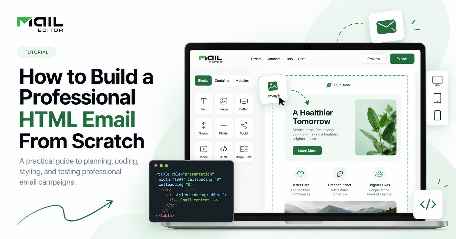
Email remains one of the most direct ways to communicate with customers, subscribers, and prospects. But a professional marketing email needs more than attractive copy. It also needs a structure that displays properly across inboxes, works on mobile devices, and guides readers toward a clear action.
That is where HTML email design becomes important.
Building an HTML email from scratch may sound technical, but the process becomes much easier when you understand the basic structure, layout rules, styling methods, and testing steps involved.
This guide explains how to build a professional HTML email from the ground up, including the practical decisions that help your email look polished across different devices and email clients.
What Is an HTML Email?
An HTML email is an email created using HTML markup rather than plain text alone.
HTML allows marketers and designers to add visual elements such as:
-
Brand colors
-
Images
-
Buttons
-
Multiple content sections
-
Columns
-
Headings
-
Styled text
-
Product blocks
-
Footers
-
Social links
Unlike a normal webpage, however, an email must work inside many different inbox environments. Gmail, Outlook, Apple Mail, Yahoo Mail, and mobile email apps can interpret HTML differently.
That is why email HTML usually needs to be simpler and more controlled than standard website HTML.
If you do not want to build every structure manually, using professionally designed HTML Email Templates can provide a reliable starting point while still allowing you to customize the design for your brand.
Step 1: Decide the Goal of the Email
Before writing any code, define the purpose of the email.
A clear goal helps determine the layout, content hierarchy, and call to action.
For example, your email may be designed to:
-
Announce a new product
-
Promote a limited-time offer
-
Share a newsletter
-
Welcome a new subscriber
-
Confirm an account action
-
Promote an event
-
Share educational content
-
Encourage readers to visit a landing page
Try to keep one primary objective per email.
If the goal is to promote a new product, the entire design should guide the reader toward learning about or viewing that product.
This makes the email easier to understand and helps prevent the design from becoming overloaded.
Step 2: Plan the Content Structure
Once the goal is clear, map out the major sections of the email.
A simple marketing email often follows this structure:
-
Preheader
-
Logo or brand header
-
Hero section
-
Main headline
-
Supporting copy
-
Call-to-action button
-
Additional content or product sections
-
Footer
-
Unsubscribe and company information
You do not need to use every section in every campaign.
The important point is to create a visual hierarchy. Readers should immediately understand what the email is about and what they are expected to do next.
A good structure also improves readability on mobile devices.
Step 3: Use a Table-Based Layout
Modern websites are commonly built with CSS Grid and Flexbox. Email design is different.
For maximum compatibility, HTML emails still commonly use tables for layout.
A simple email structure may look like this:
<table role="presentation" width="100%" cellspacing="0" cellpadding="0" border="0">
<tr>
<td align="center">
<table role="presentation" width="600" cellspacing="0" cellpadding="0" border="0">
<tr>
<td>
Email content goes here
</td>
</tr>
</table>
</td>
</tr>
</table>
The outer table creates the full-width background, while the inner table controls the main email width.
A width around 600 pixels is commonly used for desktop email layouts because it provides enough space for content while remaining manageable across many inbox environments.
Using role="presentation" also helps indicate that the table is being used for visual layout rather than tabular data.
Step 4: Keep the Email Width Controlled
Emails should not be as wide as normal webpages.
A narrower layout is easier to scan and generally adapts better to different screen sizes.
A common structure is:
<table role="presentation" width="100%" style="width:100%;">
<tr>
<td align="center">
<table role="presentation" width="600" style="width:100%; max-width:600px;">
<tr>
<td>
Your email content
</td>
</tr>
</table>
</td>
</tr>
</table>
This allows the email to remain centered on larger screens while becoming narrower on smaller displays.
Step 5: Add a Clear Header
The header should reinforce your brand without taking up too much space.
In most cases, the header contains your logo and possibly a simple navigation link or tagline.
For example:
<tr>
<td align="center" style="padding:24px;">
<img src="logo.png"
width="150"
alt="Company Name"
style="display:block; border:0;">
</td>
</tr>
Always include meaningful alt text for important images.
This helps readers understand the email even when image loading is disabled.
Step 6: Create a Strong Hero Section
The hero section is usually the first major content area a subscriber sees.
It may contain:
-
A headline
-
A short supporting paragraph
-
A hero image
-
A primary call-to-action button
Keep the message focused.
Instead of adding several competing ideas, build the hero around the email's main goal.
For example:
<tr>
<td align="center" style="padding:40px 30px;">
<h1 style="margin:0 0 16px; font-size:32px;">
Create Better Email Campaigns
</h1>
<p style="margin:0 0 24px; font-size:16px; line-height:24px;">
Build professional email designs for your next campaign.
</p>
</td>
</tr>
The headline should communicate the main benefit quickly.
Step 7: Use Inline CSS
Many website developers prefer external stylesheets. For HTML email, inline CSS remains especially useful because it improves styling consistency across many email environments.
Instead of:
<style>
.button {
background:#000000;
color:#ffffff;
}
</style>
you may apply the styling directly:
<a href="https://example.com"
style="background:#000000;
color:#ffffff;
padding:14px 24px;
text-decoration:none;
display:inline-block;">
Get Started
</a>
Inline styles make it easier for email clients to interpret important visual formatting.
Step 8: Build a Clear Call-to-Action Button
Every marketing email should make the next step easy to understand.
A call-to-action button should be:
-
Easy to identify
-
Short and descriptive
-
Large enough to tap on mobile
-
Visually separated from nearby content
Possible CTA text includes:
-
Get Started
-
Explore Templates
-
View Collection
-
Learn More
-
See What's New
-
Start Designing
A basic CTA can look like this:
<table role="presentation" cellspacing="0" cellpadding="0" border="0">
<tr>
<td style="border-radius:6px; background:#111111;">
<a href="https://example.com"
style="display:inline-block;
padding:14px 24px;
color:#ffffff;
text-decoration:none;
font-size:16px;">
Explore Now
</a>
</td>
</tr>
</table>
Keep the primary CTA prominent and avoid filling the email with too many competing buttons.
Step 9: Optimize Images for Email
Images can improve the visual impact of an email, but they should support the message rather than carry the entire message.
Follow a few practical rules:
-
Compress large images
-
Add descriptive alt text
-
Define image width
-
Use display:block where appropriate
-
Avoid putting essential text only inside images
-
Make images responsive
Example:
<img src="hero-image.jpg"
width="600"
alt="Email campaign dashboard"
style="display:block;
width:100%;
max-width:600px;
height:auto;">
This allows the image to scale down while maintaining its aspect ratio.
Step 10: Make the Email Mobile-Friendly
A large percentage of email readers open messages on phones, so mobile readability should be considered from the beginning.
You can improve mobile usability by using:
-
Single-column layouts
-
Large readable fonts
-
Comfortable spacing
-
Responsive images
-
Large CTA buttons
-
Short paragraphs
-
Clear hierarchy
Media queries can also adjust styling on smaller screens.
Example:
<style>
@media only screen and (max-width: 600px) {
.container {
width: 100% !important;
}
.mobile-padding {
padding-left: 20px !important;
padding-right: 20px !important;
}
.mobile-heading {
font-size: 26px !important;
}
}
</style>
For simple campaigns, starting with a mobile-conscious single-column layout can reduce the amount of responsive code required.
Step 11: Add Supporting Content Carefully
After the main hero section, you can add supporting content such as:
-
Feature highlights
-
Product cards
-
Testimonials
-
Educational tips
-
Event information
-
Related articles
-
Secondary CTA sections
Keep each section visually distinct.
For example:
<tr>
<td style="padding:30px;">
<h2 style="margin:0 0 12px;">Why It Matters</h2>
<p style="margin:0; line-height:24px;">
A clear email structure makes your content easier to scan and helps readers find the most important information quickly.
</p>
</td>
</tr>
Do not add sections simply to make the email longer.
Every block should support the campaign objective.
Step 12: Create a Professional Footer
The footer is an essential part of a professional marketing email.
It commonly includes:
-
Company name
-
Company information
-
Contact details
-
Social links
-
Preference links
-
Unsubscribe link
Keep the footer visually simple and easy to read.
Example:
<tr>
<td align="center"
style="padding:24px;
font-size:12px;
line-height:18px;">
Company Name<br>
Business Address<br><br>
<a href="https://example.com/preferences">
Manage preferences
</a>
|
<a href="https://example.com/unsubscribe">
Unsubscribe
</a>
</td>
</tr>
The exact compliance information required can depend on your location, audience, and email-sending platform, so make sure the footer meets the rules that apply to your campaigns.
Step 13: Keep the HTML Simple
The more complicated the email code becomes, the more difficult it can be to maintain.
Where possible:
-
Use simple nested tables
-
Avoid unnecessary scripts
-
Avoid overly complex positioning
-
Use familiar HTML elements
-
Keep important styles inline
-
Use supported CSS carefully
-
Remove unused code before sending
HTML email development generally rewards simplicity.
A clean structure is easier to edit, troubleshoot, and reuse.
Step 14: Test the Email Before Sending
Never assume that an email will look identical everywhere.
Before sending a campaign, check it across multiple environments.
At minimum, review:
-
Desktop layout
-
Mobile layout
-
Gmail
-
Outlook
-
Apple Mail or iPhone Mail
-
Images
-
CTA links
-
Alt text
-
Spacing
-
Footer links
-
Unsubscribe link
You should also send test emails to yourself before launching the full campaign.
Pay close attention to:
-
Broken layouts
-
Oversized images
-
Text wrapping
-
Button alignment
-
Unexpected spacing
-
Links that point to the wrong destination
Testing is one of the most important parts of building reliable HTML emails.
Step 15: Save the Design as a Reusable Template
Once the email is working properly, turn it into a reusable template.
Reusable templates can help teams maintain consistent:
-
Branding
-
Typography
-
Colors
-
CTA styles
-
Headers
-
Footers
-
Content spacing
-
Layout patterns
Instead of rebuilding every campaign from scratch, you can duplicate the base template and change only the campaign-specific content.
You can also start with Free HTML Email Templates when you want ready-made layouts that can be adapted for newsletters, promotions, product announcements, and other campaigns.
When an HTML Email Builder Makes More Sense
Hand-coding HTML emails is useful when you need complete control over the markup or want to understand how email layouts work.
However, marketers and teams do not always need to manually code every campaign.
A visual HTML Email Builder can make the process faster by allowing you to create sections, adjust spacing, add buttons, insert images, and customize layouts through a visual interface.
For example, MailEditor provides a visual environment for building and editing professional email designs while still supporting HTML-based email workflows.
This can be especially helpful when marketers, designers, and developers need to collaborate without requiring every person on the team to write HTML manually.
Common HTML Email Mistakes to Avoid
Even a well-designed email can become difficult to use if a few basic principles are overlooked.
Making the Layout Too Complex
Complex multi-column structures can be harder to maintain and may require more responsive adjustments.
Use a simple layout unless the content genuinely requires something more advanced.
Using Tiny Text
Email should be comfortable to read on both desktop and mobile devices.
Body text that is too small creates unnecessary friction.
Adding Too Many CTAs
Multiple CTAs can compete for attention.
Choose one primary action and use secondary links only when they support the main objective.
Relying Entirely on Images
Important information should also exist as live text.
Some recipients may have images disabled, and live text is generally easier to read, resize, and access.
Forgetting Mobile Testing
An email that looks excellent on desktop can still require adjustments on smaller screens.
Always test before sending.
A Simple HTML Email Checklist
Before launching your campaign, confirm that:
-
The email has one clear objective
-
The layout is easy to scan
-
The main message appears early
-
The CTA is easy to identify
-
Images have useful alt text
-
The design works on mobile
-
The email width is controlled
-
Important styles are compatible
-
Links have been tested
-
The footer includes necessary information
-
The email has been previewed in major inbox environments
A short pre-send checklist can prevent many common mistakes.
Final Thoughts
Building a professional HTML email from scratch is mostly about combining good structure with simple, reliable code.
Start by defining one clear objective. Build the layout with tables, keep important styles straightforward, use responsive images, create a strong CTA, and test the finished email across different devices and inbox environments.
Once you have a reliable structure, you do not need to rebuild every campaign from the beginning.
You can reuse your own layouts, customize ready-made HTML templates, or work with a visual email builder such as MailEditor to speed up the design process.
The best HTML emails are not necessarily the most complicated. They are the ones that make the message clear, keep the design consistent, and make it easy for the reader to take the next step.